
Free dashboard software is a tool that helps you turn raw data into visual reports, charts, and KPI dashboards without paying upfront.
Best free dashboard software: 25 tools compared at a glance
Best Free Dashboard Software for Google ecosystem reporting
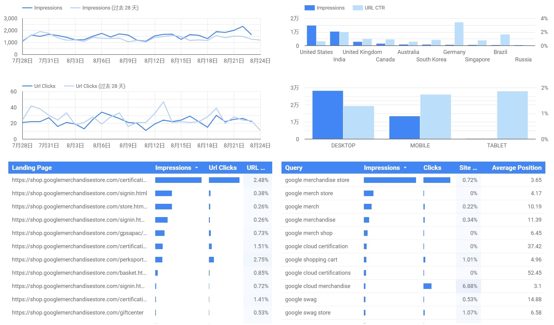
1. Looker Studio
One-sentence overview: A free, browser-based dashboard tool built for reporting across Google products and common marketing data sources.
 Key Features:
- Native integration with Google Analytics, Google Ads, Search Console, BigQuery, and Google Sheets
- Shareable web dashboards
- Templates for marketing and executive reporting
- Basic calculated fields and blending
Pros & Cons:
- Pros: Free to use, easy sharing, strong Google connectivity, fast setup
- Cons: Performance can slow on poorly structured data, advanced modeling is limited, third-party connector quality varies
Best For: Marketers, agencies, and teams already working inside the Google ecosystem
2. Google Sheets dashboards
One-sentence overview: A lightweight option for building simple dashboards directly inside spreadsheets.
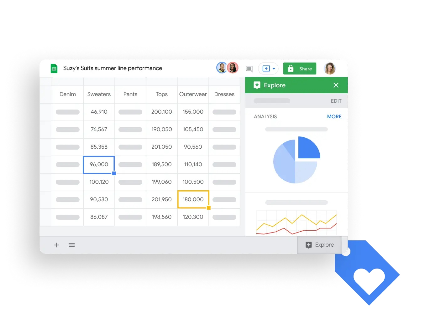 Key Features:
- Pivot tables and charts
- Easy collaboration
- Familiar spreadsheet environment
- Add-ons and Apps Script automation
Pros & Cons:
- Pros: Extremely accessible, flexible for ad hoc reporting, no extra software needed
- Cons: Limited scalability, weaker governance, manual maintenance increases over time
Best For: Small teams, personal dashboards, lightweight KPI tracking
Best for public data storytelling and visualization
3. FineReport
One-sentence overview: A reporting and dashboard platform suited to organizations that need polished data presentation, fixed-format reporting, and broad visualization options.
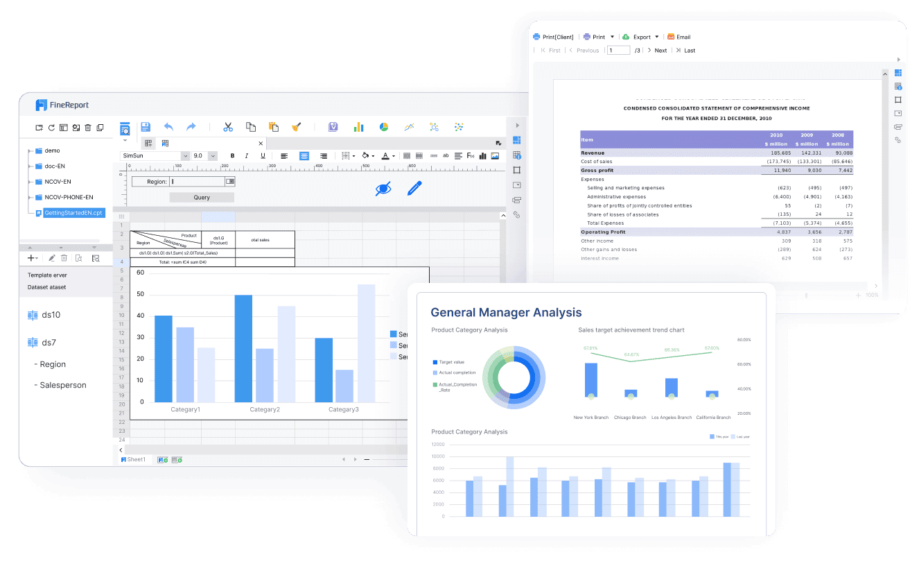 Key Features:
- Pixel-level report design
- Interactive dashboards
- Data entry and reporting workflows
- Support for multiple data sources
Pros & Cons:
- Pros: Strong reporting layout control, suitable for formal business reports, useful for mixed dashboard and reporting needs
- Cons: Better aligned with enterprise reporting than lightweight personal use, some advanced needs may require paid deployment
Best For: Enterprises needing structured reports plus dashboards, especially where presentation format matters
4. Tableau Public
One-sentence overview: A well-known free dashboard software option for interactive visual storytelling when public sharing is acceptable.
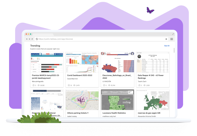 Key Features:
- Rich charting and visual design
- Interactive dashboards
- Large template and community ecosystem
- Storytelling-oriented presentation
Pros & Cons:
- Pros: High visual quality, flexible design, strong learning resources
- Cons: Published dashboards are public, not suitable for private business reporting, limited governance
Best For: Public portfolios, data storytelling, journalism, and learning data visualization
5. Datawrapper
One-sentence overview: A simple chart and dashboard-style publishing tool focused on clean, readable visuals.
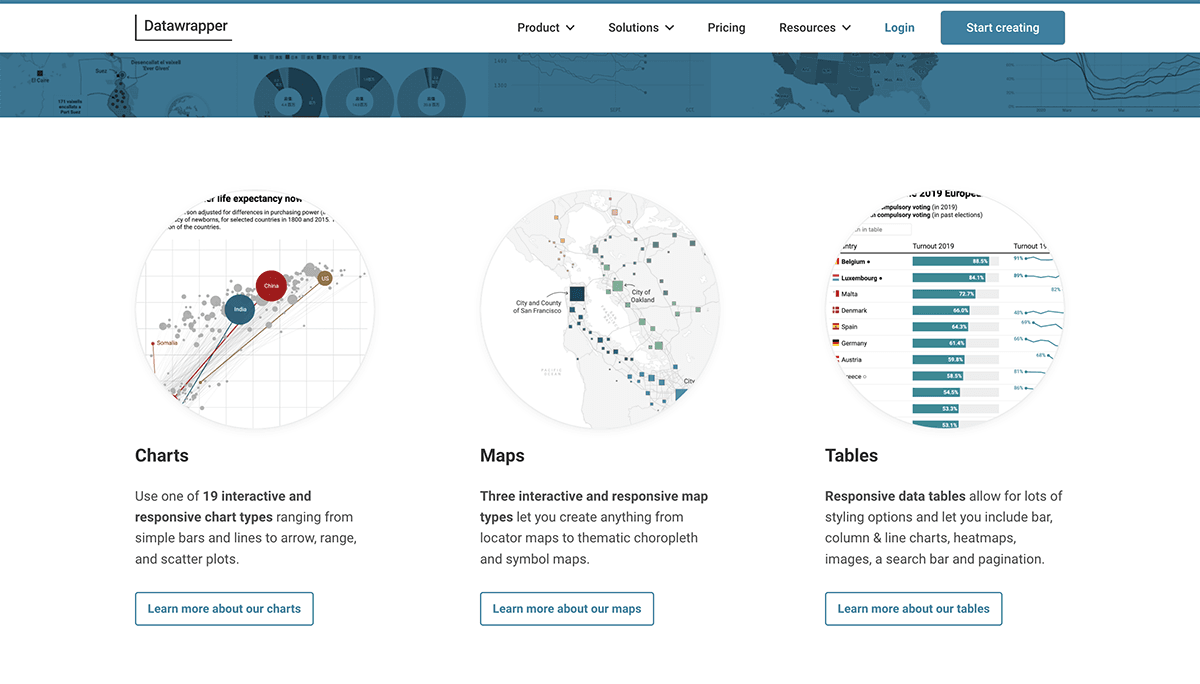 Key Features:
- Fast chart creation
- Map and table support
- Embeddable visuals
- Clean default styles
Pros & Cons:
- Pros: Easy to learn, polished output, effective for fast publishing
- Cons: Narrower BI depth, less suited for complex internal analytics workflows
Best For: Editorial teams, content marketers, and users prioritizing visual clarity over deep BI functionality
Best for business intelligence and internal reporting
6. FineBI
One-sentence overview: A self-service BI and dashboard platform designed for internal reporting, business analysis, and governed data exploration.
 Key Features:
- Drag-and-drop dashboard building
- Self-service analysis
- Data modeling and reusable metrics
- Broad database and business data connectivity
Pros & Cons:
- Pros: Strong balance of usability and BI depth, suitable for business teams, supports enterprise-style dashboarding
- Cons: Enterprise needs may require paid deployment and administration planning
Best For: Companies that want self-service business intelligence with room to scale
Note: FineBI offers a free personal edition, while the enterprise edition is paid. If you want to start with free dashboard software but keep a path to more formal organizational deployment, FineBI is one of the more practical options.
7. Metabase
One-sentence overview: An open source BI tool that makes internal dashboarding approachable for non-technical and SQL-savvy users alike.
 Key Features:
- Friendly query builder
- SQL editor
- Dashboard filters and drill-through
- Self-hosting and embedding options
Pros & Cons:
- Pros: Easy setup, clean interface, strong value for startups, good self-service analytics
- Cons: Advanced governance and enterprise controls may require paid tiers or more setup
Best For: Startups, internal BI, product analytics, and teams wanting open source flexibility
8. Power BI Free
One-sentence overview: Microsoft’s free entry point for desktop analytics and dashboard creation.
 Key Features:
- Desktop report building
- Strong Excel integration
- Data modeling with Power Query and DAX
- Broad enterprise upgrade path
Pros & Cons:
- Pros: Powerful analytics engine, excellent for Microsoft-centric users, strong modeling capabilities
- Cons: Free use is restrictive for collaboration and cloud sharing, learning curve can be steep
Best For: Solo analysts, Excel power users, and teams likely to upgrade into Microsoft BI workflows
9. Apache Superset
One-sentence overview: A highly customizable open source analytics platform for technical teams that want control over dashboards and data access.
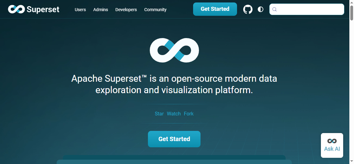 Key Features:
- SQL IDE
- Visualization library
- Role-based access controls
- Self-hosted deployment
Pros & Cons:
- Pros: Flexible, scalable, open source, strong for technical environments
- Cons: Setup and maintenance are heavier, less beginner-friendly than simpler tools
Best For: Data teams, engineers, and organizations that want a customizable self-hosted BI stack
10. Grafana
One-sentence overview: A leading dashboard platform for operational, infrastructure, and time-series monitoring.
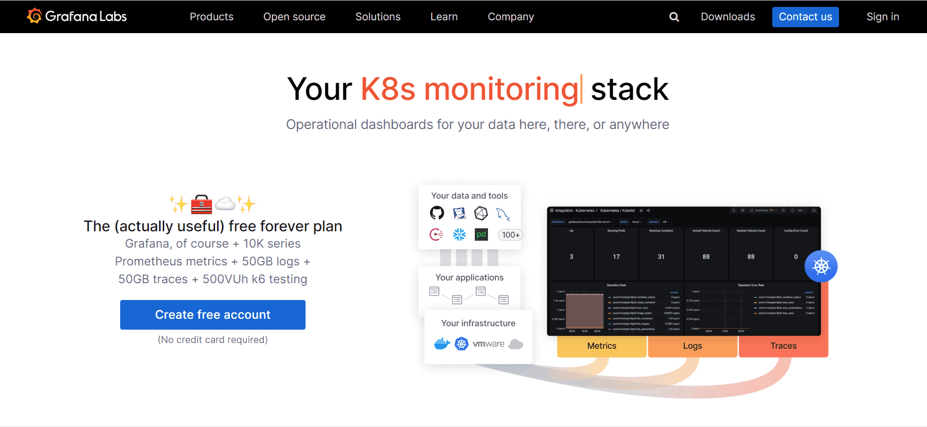 Key Features:
- Real-time dashboards
- Alerts and monitoring workflows
- Wide data source support
- Strong time-series visualization
Pros & Cons:
- Pros: Excellent for live monitoring, mature plugin ecosystem, strong operational visibility
- Cons: Less ideal for classic business reporting, can be overkill for simple dashboards
Best For: DevOps, engineering, IT operations, and teams tracking live metrics
11. Redash
One-sentence overview: A SQL-first dashboard tool focused on fast query-to-visualization workflows.
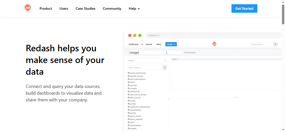 Key Features:
- SQL editor
- Query scheduling
- Dashboard creation
- Multiple data source support
Pros & Cons:
- Pros: Straightforward for analysts, efficient for SQL workflows, simple dashboard assembly
- Cons: Less friendly for non-technical users, lighter feature depth than broader BI suites
Best For: SQL-based analytics teams and internal reporting environments
Best for embedded analytics and open source flexibility
12. Metabase for embedded analytics
One-sentence overview: Metabase also stands out when you need customer-facing dashboards without building everything from scratch.
Key Features:
- Embedded dashboards
- Permissions and data access controls
- White-label options in higher tiers
- Self-hosted flexibility
Pros & Cons:
- Pros: Faster than building in-product analytics internally, good balance of usability and control
- Cons: More advanced embedding customization may require paid plans
Best For: SaaS teams testing embedded analytics
13. Apache Superset for embedded analytics
One-sentence overview: Superset is a strong fit for teams comfortable extending open source tools for customized analytics delivery.
Key Features:
- API and extensibility
- Self-hosted control
- Flexible visualization setup
- Granular permissions
Pros & Cons:
- Pros: Full control, no vendor lock-in pressure, scalable architecture
- Cons: More engineering effort, less plug-and-play
Best For: Technical teams building tailored internal or embedded analytics experiences
14. Grafana for embedded panels
One-sentence overview: Grafana can support embedded views for monitoring and operational analytics.
Key Features:
- Embedded panels
- Real-time charts
- Alert-linked dashboards
- Broad observability integrations
Pros & Cons:
- Pros: Strong for live operational dashboards, excellent time-series support
- Cons: Not ideal for standard business-facing embedded BI
Best For: Product teams exposing performance, uptime, or system telemetry
15. Redash for embedded SQL dashboards
One-sentence overview: Redash offers a lightweight way to expose query-driven dashboards to internal users.
Key Features:
- Query sharing
- Dashboard URLs
- Scheduled refreshes
- Multi-source querying
Pros & Cons:
- Pros: Simple, efficient, relatively easy for analyst-led deployments
- Cons: Limited polish compared with more mature embedded analytics platforms
Best For: Internal tools and lightweight embedded reporting
Best for no-code, lightweight, or AI dashboard creation
16. Klipfolio free options
One-sentence overview: Klipfolio is designed for KPI tracking and business dashboard assembly with a focus on operational visibility.
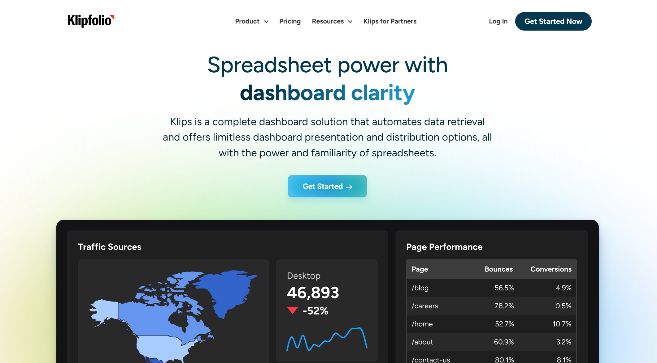 Key Features:
- KPI dashboards
- Business metric tracking
- Templates
- Cloud connectivity
Pros & Cons:
- Pros: Good for metric-focused dashboards, practical for business users
- Cons: Free access and feature scope can be limited compared with fully free tools
Best For: Teams wanting focused KPI dashboards
17. Zoho Analytics free plan
One-sentence overview: Zoho Analytics provides a user-friendly reporting environment with AI-assisted dashboard generation and broad business use cases.
 Key Features:
- Drag-and-drop dashboards
- AI assistant capabilities
- Multiple chart types
- Data import and connectors
Pros & Cons:
- Pros: Accessible interface, useful for SMB reporting, supports AI-assisted analysis
- Cons: Free plan limits can constrain scale, advanced collaboration may require upgrade
Best For: Small businesses and non-technical users who want guided dashboard creation
18. Coda dashboards
One-sentence overview: Coda lets teams create lightweight operational dashboards inside collaborative documents.
 Key Features:
- Table-based dashboarding
- Team collaboration
- Automations
- Custom views
Pros & Cons:
- Pros: Flexible for workflows, combines docs and dashboards, easy for team operations
- Cons: Not a full BI platform, weaker for complex analytics
Best For: Cross-functional teams, project operations, and lightweight reporting
19. Airtable interfaces
One-sentence overview: Airtable interfaces turn structured records into simple internal dashboards and workflow views.
 Key Features:
- No-code app building
- Interface designer
- Shared internal views
- Record-based reporting
Pros & Cons:
- Pros: Very approachable, good for operational dashboards, strong for workflow-centric teams
- Cons: Less analytical depth than BI-first tools, data scale can become a constraint
Best For: Operations, project management, and internal team dashboards
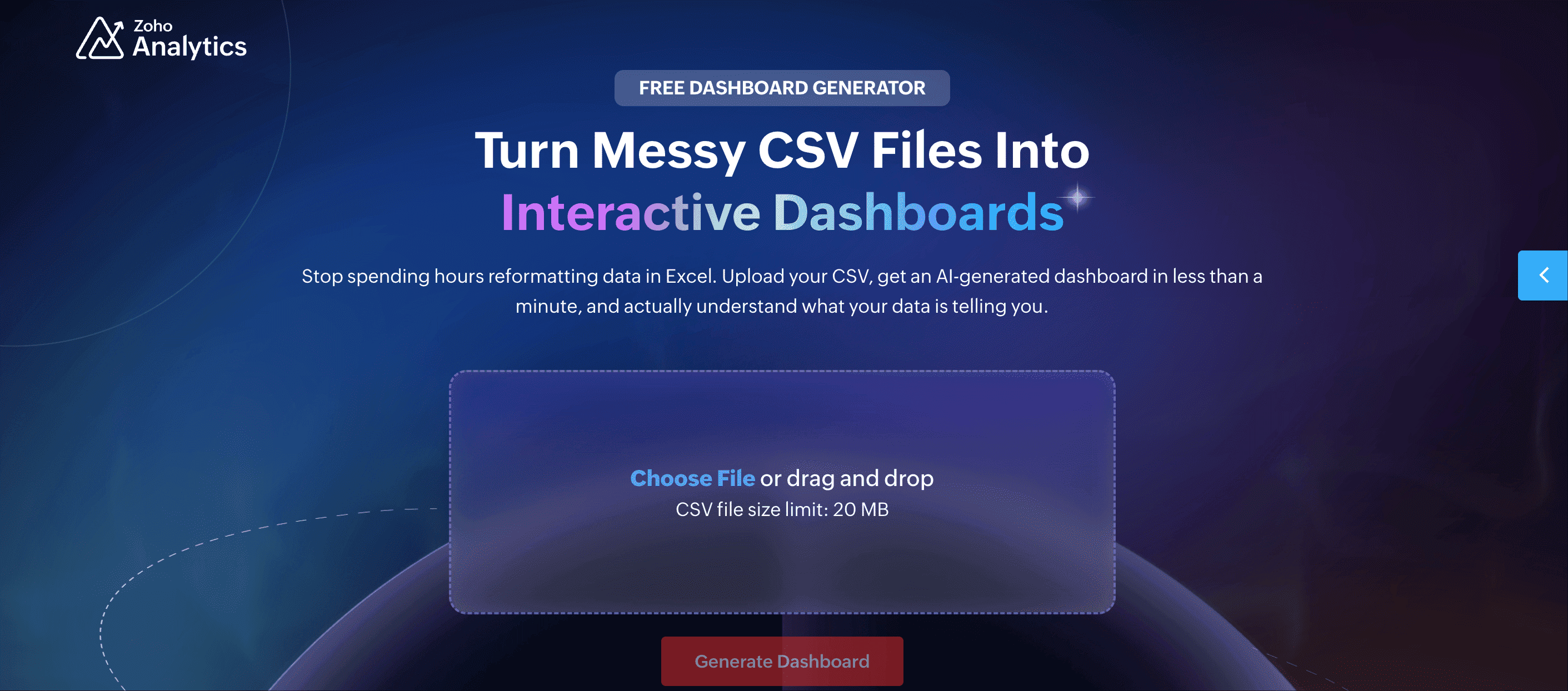
20. Zoho free dashboard generator
One-sentence overview: A fast AI dashboard maker that turns CSV files into instant visual dashboards.
 Key Features:
- CSV upload
- Automatic chart selection
- AI-generated dashboard layout
- Quick testing without heavy setup
Pros & Cons:
- Pros: Very fast for experimentation, no deep technical skill needed
- Cons: Better for quick dashboard generation than long-term governed reporting
Best For: Users who want instant dashboard prototypes from spreadsheet data
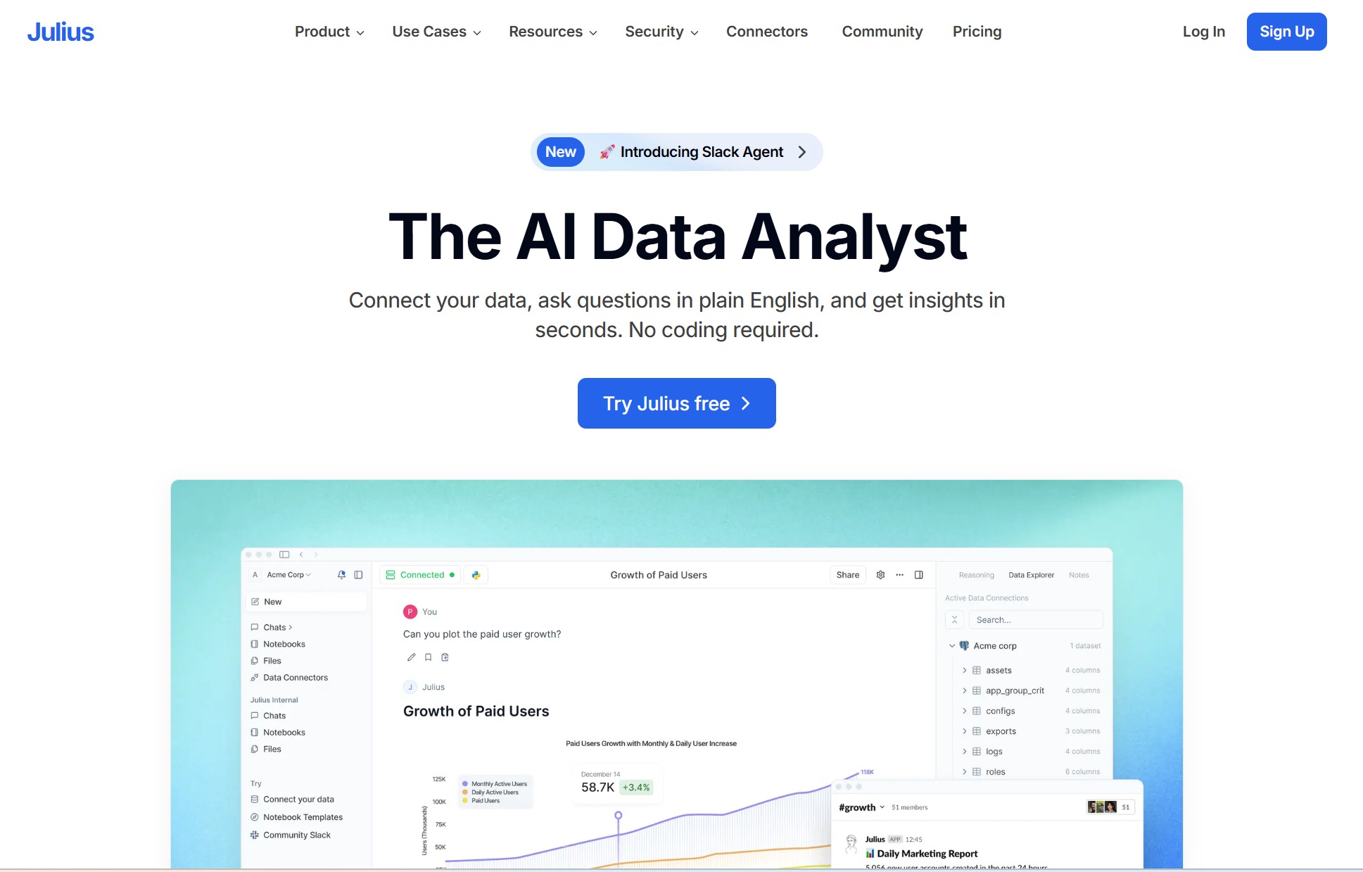
21. Julius-style AI dashboard tools
One-sentence overview: New AI-assisted dashboard makers can reduce setup time by generating charts, summaries, and layouts from uploaded data.
 Key Features:
- Prompt-based analysis
- Auto-generated visuals
- Quick summaries
- Guided exploration
Pros & Cons:
- Pros: Fast onboarding, low technical barrier, useful for first-pass analysis
- Cons: Output quality varies, governance and repeatability may be weak
Best For: Rapid experimentation and individual analysis
22. Notion widget dashboards
One-sentence overview: Notion-based dashboard setups combine linked databases, widgets, and embeds for personal or team tracking.
 Key Features:
- Embedded widgets
- Linked databases
- Simple KPI pages
- Team collaboration
Pros & Cons:
- Pros: Easy to organize, flexible for personal productivity dashboards
- Cons: Limited native analytics depth, more of a workspace dashboard than BI software
Best For: Personal dashboards, startup operations, content planning
23. Retool free tier dashboards
One-sentence overview: Retool helps technical and semi-technical teams build internal dashboard apps quickly.
 Key Features:
- Internal app builder
- Database connections
- UI components
- Workflow automation
Pros & Cons:
- Pros: Fast internal tool development, flexible interfaces
- Cons: More app-builder than classic dashboard software, free limits may narrow usage
Best For: Internal tooling and operational admin dashboards
24. Domo free trial or limited entry options
One-sentence overview: Domo is a cloud BI platform sometimes explored through trial access rather than a broad forever-free plan.
 Key Features:
- Cloud dashboards
- Connector ecosystem
- Team collaboration
- Mobile reporting
Pros & Cons:
- Pros: Strong business dashboard experience, good executive reporting
- Cons: Usually not the best fit if you strictly need long-term free dashboard software
Best For: Teams evaluating premium BI with a test-first approach
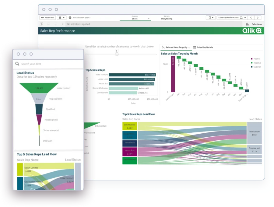
25. Qlik Sense trial or free learning path
One-sentence overview: Qlik Sense is a robust analytics platform known for associative analysis, though free access is typically limited.
 Key Features:
- Interactive exploration
- Associative engine
- Advanced analytics
- Enterprise scalability
Pros & Cons:
- Pros: Powerful data discovery, strong analytical flexibility
- Cons: Free usage is limited for ongoing production needs
Best For: Teams exploring advanced analytics before a paid rollout
What to look for in free dashboard software in 2026
Before choosing any free dashboard software, define what success looks like in your actual workflow. A tool that is excellent for marketing reports may be a poor fit for product analytics or internal BI.
Define your primary use case first
Start by clarifying whether you need dashboards for:
- Business reporting
- Marketing analytics
- Product KPIs
- Personal dashboards
- Embedded analytics
- Operational monitoring
This step matters because the market is fragmented. Looker Studio is often stronger for marketing reporting. Grafana is better for time-series operations dashboards. Metabase and FineBI are generally better for internal business intelligence. Tableau Public is useful when public-facing presentation is the priority.
Compare free plan limits carefully
The biggest mistake with free dashboard software is assuming “free” means practically usable at scale. In reality, free plans often limit the parts that matter most.
Check these items carefully:
- User caps
- Dashboard or workspace caps
- Data refresh frequency
- Storage limits
- Connector restrictions
- Sharing and embedding rules
- Branding or watermarking
- Export formats
- Public vs private dashboard publishing
A tool may look generous until you realize private sharing, scheduled refreshes, or multi-user collaboration sit behind a paywall.
Evaluate dashboard creation workflow
Ease of use varies widely. Some tools are optimized for self-service drag-and-drop dashboard building. Others assume you know SQL or can manage data modeling.
Useful questions include:
- Can business users build dashboards without analyst support?
- Are templates available?
- Is there AI-assisted setup or chart recommendation?
- Can advanced users switch to SQL when needed?
- Does the tool support reusable metrics or semantic modeling?
If you need broad business adoption, usability often matters more than edge-case customization.
Consider privacy, hosting, and security
This is one of the most important filters in 2026. Some free dashboard software products are cloud-based and simple to start with, but that may create data governance concerns. Others are open source and self-hosted, which improves control but increases maintenance responsibility.
You should verify whether your data is:
- Public by default
- Private by default
- Hosted in vendor cloud infrastructure
- Self-hosted by your team
- Processed by AI features or external models
For example, Tableau Public is excellent for public data storytelling, but it is not appropriate for sensitive internal business reporting.
Which free dashboard software is best for each use case?
Best for marketing and website reporting
For most Google-centric teams, Looker Studio is the easiest place to start. It connects naturally to common acquisition and website data sources, supports quick sharing, and reduces setup friction.
Datawrapper can complement it when chart clarity and visual polish matter more than multi-source BI functionality. This is especially true for content teams, editorial reporting, and campaign visuals that need embedding.
Best for startups, internal BI, and product analytics
Metabase offers one of the best balances of usability and BI depth. It is approachable enough for business teams, but still useful for analysts and engineers who need SQL access.
FineBI is also worth strong consideration here if your team wants a more business-oriented self-service analytics environment. Because FineBI’s personal edition is free and the enterprise edition is paid, it can fit individuals, analysts, and teams that may later need a more structured rollout.
Apache Superset is better for technical teams that prioritize flexibility and customization over ease of onboarding.
Best for operations, engineering, and live monitoring
Grafana stands out because it is purpose-built for time-series metrics, real-time observability, and alert-driven operations. If your dashboard needs to show infrastructure health, uptime, logs, latency, or service performance, it is usually a stronger fit than a general BI tool.
Best for public sharing, portfolios, and storytelling
Tableau Public works best when public visibility is acceptable and dashboard presentation quality matters most. It is especially useful for consultants, analysts, students, journalists, and anyone building a portfolio of interactive visual work.
How to choose among free dashboard tools without wasting time
A fast evaluation process can save weeks of rework.
Start with your data sources
Make a shortlist based on what you already use:
- Spreadsheets
- SQL databases
- Cloud data warehouses
- Ad platforms
- Product analytics sources
- Internal apps
If your most important connector is weak, the rest of the product does not matter much.
Eliminate tools with blocking free plan limits
The most common blockers are:
- Too few users
- No private sharing
- Slow or infrequent refreshes
- No exports
- Limited dashboards
- No embedding
- Restricted connectors
This step quickly removes tools that look appealing on paper but fail in production-like use.
Test two or three finalists with the same dashboard
Build the same dashboard in each shortlisted tool. Compare:
- Setup speed
- Data connection reliability
- Chart flexibility
- Load performance
- Ease of filtering
- Sharing workflow
- Learning curve for non-technical users
A side-by-side build usually exposes the real differences faster than feature lists do.
Check the upgrade path before committing
Even if you begin with free dashboard software, growth changes requirements. Review:
- Paid connector pricing
- Private sharing options
- Embedding support
- Governance and admin controls
- Role permissions
- Security certifications
- Deployment flexibility
This is where tools like FineBI, Power BI, and Metabase deserve extra attention, because they can support more structured growth depending on your organization’s needs.
Final verdict: the best free dashboard software for different needs
If you want the short answer, here is the practical breakdown.
- Best overall for quick business reporting: Looker Studio
- Best for public data visualization: Tableau Public
- Best open source BI option: Metabase for simplicity, Apache Superset for customization
- Best for operational monitoring: Grafana
- Best for self-service internal BI with growth potential: FineBI
FineBI personal edition is free, while the enterprise edition is paid, which makes it especially relevant if you want to start small and preserve an upgrade path.
The best free dashboard software ultimately depends on what matters most to you:
- Ease of use
- Privacy
- Advanced analytics
- Self-hosting
- Public sharing
- Scalability
If you are unsure, start with Looker Studio for marketing reporting, Metabase or FineBI for internal BI, Grafana for monitoring, and Tableau Public for public storytelling. That short list covers most real-world dashboard needs without wasting time on tools that do not match the job.


