HOME  >>  Single Blog

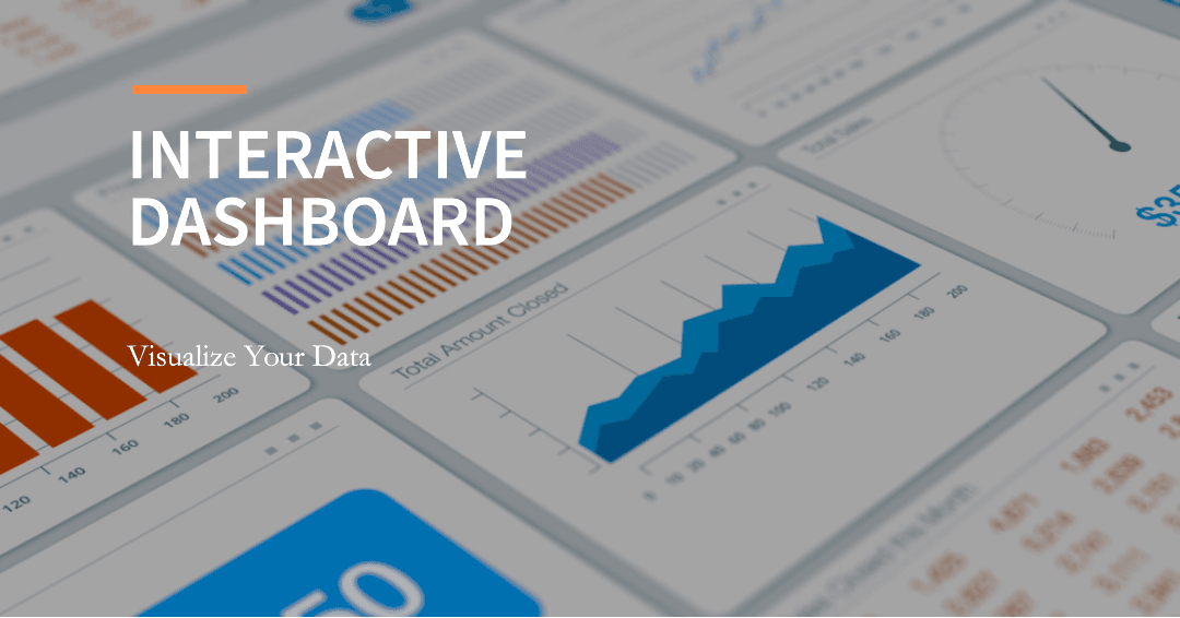
What is an Interactive Dashboard? Definition, Features & Examples

Dashboard

Published: July 07, 2023    |     null MIN READ

Share

blog-banner

Throughout the article, we will explore the definition and features of interactive dashboards, also showcase some best examples of interactive dashboards and provide a step-by-step guide on how to create them.

Table Of Contents

What is an Interactive Dashboard?

An interactive dashboard is a data management tool that allows users to view data visually and intuitively and interact with the data. It helps users explore data more deeply and make informed, data-driven business decisions.

Interactive dashboards typically consist of a graphical interface that includes various indicators, charts, tables, images, and control elements. These elements can display real-time or historical data, enabling users to monitor and track the performance of specific metrics or key performance indicators in real time. They may also include interactive features such as data filtering, sorting, searching, and drill-down capabilities, allowing users to focus on specific subsets of data or explore data in greater detail.

The purpose of such dashboards is to enhance the efficiency of workflows for users by presenting massive amounts of data in customizable interactive pages. Users can interact with the dashboard by selecting different data filters, adjusting parameters, drilling down into details, and performing various actions. By exploring and analyzing the data, users can discover patterns, trends, and correlations, and derive meaningful insights. Now that we have explained the meaning of an interactive dashboard, let's move on to the next important aspect.

Interactive Dashboard.gif


Interactive Dashboards vs. Static Reporting

Interactive dashboards provide more flexibility, customization, and real-time data analysis and decision support capabilities compared to static reports. They encourage users to actively engage in data exploration, helping them gain a better understanding of the data and make more targeted decisions. On the other hand, static reporting is more suitable for conveying predefined analysis results and conclusions, catering to one-time data presentation and fixed reporting needs.

Specifically, the advantages of interactive dashboards over static reports can be seen in the following aspects:

  • Real-time data updates: In a competitive market, the speed of information processing determines the success of a business. Traditional reports and presentations are based on past data snapshots or specific time periods, requiring manual recording and updating of data, which inevitably leads to inefficiencies. Interactive dashboards can provide real-time analysis of data and instant data visualization, enabling users to keep abreast of the latest data.
  • Data interaction and exploration: Interactive dashboards allow users to interact with data, including operations such as selection, filtering, sorting, and drilling down. This empowers users to freely explore the data based on their own needs and interests, discovering new insights and correlations. Static reports cannot meet the demand for free data exploration by users.
  • Instant decision support: With the support of real-time data updates and interactive features, any business-related questions can be answered using the latest information. This means that interactive dashboards can help users make accurate and timely decisions based on data when needed. This indicates that the decision-making capability and quality of the business have been elevated to a whole new level.
  • Empowering business users: Through interactive dashboards, business users can quickly perform requirement analysis without having to rely on requests from the IT department. This helps save valuable IT resources and reduces the need for database queries and complex customizations. At the same time, IT professionals can better focus on other tasks beyond paperwork and reporting.
  • Customization and personalization: Interactive dashboards can be customized and personalized based on users’ needs and preferences. Users can choose the relevant metrics of interest, adjust the visualization styles, and apply data filters to meet their specific requirements. In contrast, the content and format of static reports are usually fixed, limiting the users' customization capabilities.

10 Interactive Dashboard Features

Now that we know what interactive dashboards are and how they differ from static reports, let's take a closer look at some of the functionalities of interactive dashboards.

Data Visualizations

The goal of data visualization is to convey information through visual representations, and interactive dashboards enable the visualization of data in the form of charts, graphs, and metrics. This makes the data easier to understand and analyze, allowing you to quickly identify trends, patterns, and anomalies. Common visualization forms include:

1. Line Charts: Used to display trends in data over time. If you have a sales dashboard and want to compare sales figures on a monthly/quarterly/yearly basis, line charts provide a visual representation of the data's upward, downward, or stable trends. Interactive line charts can offer features such as zooming, dragging, and hovering, allowing you to examine specific periods or data points in more detail.

2. Pie Charts: Pie charts can be used to show the proportions of different parts within a whole. Through an interactive dashboard, you can obtain more detailed information by clicking on different sections of the pie chart. You can also select specific data dimensions or time ranges dynamically to display changes and distributions.

3. Stacked Bar Charts: Unlike regular bar charts, stacked bar charts can be used to compare the contributions or proportions of multiple categories within a whole. Each bar can be divided into multiple segments, representing subcategories or different data groups within the category. In an interactive dashboard, stacked bar charts can be linked with other charts or filters, allowing for dynamic control and filtering of data. You can quickly obtain desired data perspectives by selecting specific categories or time ranges and interacting with other charts.

4. Bubble Charts: In a bubble chart, clusters or groups of bubbles can be formed by aggregating bubbles with similar characteristics or variable performance. The position and size variations of the bubbles can help observers intuitively compare and analyze multiple indicators or variables among different categories. In an interactive dashboard, bubble charts can be used for multivariable comparison, cluster analysis, trend observation, and interactive analysis.

FineBI Dynamic Charts

Drill Down 

When you don't want to clutter the visual effect with multiple charts but simply delve into accessible data and provide additional information for potential issues, you can utilize the Drill Down functionality in an interactive dashboard. This feature allows you to explore the hierarchical structure of data by progressively expanding the level of detail, enabling you to obtain more comprehensive and specific information.

Drill Down functionality navigates through the hierarchical structure of data. In an interactive dashboard, data is typically organized into multiple levels such as geographic regions, time dimensions, product categories, etc. Users can delve into the data by selecting specific dimensional levels. As you select a particular dimensional level, the dashboard will accordingly display more detailed data. For example, in the order list below, you can have an overview of all order information within a time range, including order ID, order time, customer name, etc. When you select a specific ID, the dashboard will show the product category, price, and quantity purchased in that order. Furthermore, you can further examine more detailed information about the product.

During the Drill Down process, the dashboard usually maintains the previous context information. This means that when users step back to higher levels, the dashboard retains the previous filtering conditions and selections, ensuring seamless switching and comparison between different levels of data.

Drill Down.gif
Drill Down

Drill Through

Unlike Drill Down, which shows more specific data details within the same level, Drill Through allows users to further investigate more detailed information at a summarized level by typically navigating to the next level or related reports containing more specific data.

In the example below, users can gain deeper insights and perform detailed analyses of supply chain data through drill-through functionality. From a certain data point, other relevant information is expanded, such as the name or index of the supplier, delivery performance, quality data, contract information, etc., so that users can drill down to the specific details of each supplier.

Drill Through.gif
Drill Through

Component Jump

In a complex dashboard, which may contain a large amount of data and various metrics, Component Jump provides a more in-depth data exploration and navigation experience. It allows users to navigate to another related component or detailed information page by clicking or selecting a component (such as a chart, button, or metric) on the dashboard. Users can quickly locate the data they are interested in without having to browse the entire dashboard. This saves time and effort, enabling users to efficiently access the desired information.

Worth mentioning that, it is important to ensure clear logic for component transitions and provide appropriate navigation cues during design to ensure a good user experience and effective data navigation.

Component Jump.png
Component Jump

Data Filters

Through the data filtering functionality, you can use various filters and conditions in an interactive dashboard to refine the displayed data and view specific subsets of data according to your needs. This feature is extremely useful for data analysis, exploration, and decision-making as it enables users to focus on the data of interest while excluding irrelevant or unrelated data. For example, you can apply filters based on different dimensions such as product, personnel, and location. 

Additionally, you can select a specific time range to limit the data display. If you want to precisely filter sales data for a specific product category and a particular region, the dashboard also supports applying multiple-dimension filter conditions to further narrow down the data scope.

Data Filters.gif
Data Filters

Text Boxes and Tooltips

FineBI’s text boxes and tooltips functionality can provide additional contextual information, including background knowledge, data metric explanations, key insights, and more. They also help you access detailed information about specific components, charts, or data points, allowing for a deeper understanding of the data. Text Boxes are typically presented as static or dynamic text and can contain words, numbers, headings, paragraphs, and other content. In interactive dashboards, Text Boxes are often fixed on the dashboard for easy reference. When you hover over specific components, charts, or data points on the dashboard, Tooltips display additional information, explanations, or data details, including key metrics, data descriptions, units, date ranges, and more, helping you delve into the data and gain more contextual information.

Map Zooming

While you can leverage a well-designed dashboard to understand your data story, a powerful interactive dashboard offers multi-layered knowledge, allowing you to gain the optimal perspective of maps. The Map Zooming feature in the FineBI dashboard enables users to zoom in and out on maps. You can adjust the zoom level of the map to examine geographic data in greater detail by using the mouse scroll wheel or clicking the zoom in/zoom out buttons.

This interactive map zooming functionality is particularly useful for showcasing and analyzing geographic data. It allows users to delve into specific regions on the map, oband serve geographical distributions, spatial relationships, and trends. For example, in a sales dashboard, users can zoom in on the map to view detailed information about specific regions or cities with high sales revenue, facilitating more nuanced analysis and decision-making.

Map Zooming.gif
Map Zooming

Feel free to make an appointment for a live demo with our product experts. We will be more clear about your needs and see how FineBI can help you and your organization transform data into value.


Chart Linkage

Our business does not exist in isolation, and therefore, your dashboards should not be isolated either. Each dashboard should be a real-time snapshot of your business. By combining and connecting these snapshots, your business intelligence will reach a new level.

FineBI's Chart Linkage feature allows for the establishment of connections or associations between different charts. With Chart Linkage, when a user interacts with one chart (such as selecting specific data points, adjusting filtering conditions, or changing view settings), other related charts will update accordingly to reflect these changes. This interlinking functionality between charts helps users quickly compare and analyze data relationships across different charts. It provides a seamless data navigation and exploration experience, enabling users to gain a comprehensive understanding of the data.

Chart Linkage.gif
Chart Linkage

Filter Component

The Filter Component in interactive dashboards is a functional component designed to assist users in filtering and refining data. It allows users to define and apply specific filtering conditions to limit the displayed data, enabling them to focus on the subset of data that is of interest to them. The Filter Component is typically presented in an interactive format, allowing users to select different options, set conditions, or input values to customize the data filtering rules according to their needs. FineBI's Filter Component offers various essential features, such as Sorting Filtered Values, Customizing the Control Range, Passing Default Value for Login Name, Clearing Selected Data, and more.

By utilizing the Filter Component, users can filter data based on different dimensions, metrics, time ranges, and other parameters, and view the filtered results in real time. The presence of the Filter Component provides a more flexible and personalized data browsing and analysis experience, enabling users to explore and understand data in a more precise manner.

Filter Component.gif
Filter Component

Dynamic Carousel Line Chart

The Dynamic Carousel Line Chart displays multiple lines or series of data in a carousel-like manner. It presents data in a time-series format or data that varies across specific dimensions or categories.

The chart consists of a line graph that represents data points for each series or category. The carousel functionality allows users to navigate through different lines or series by clicking or swiping, offering a dynamic interactive experience. The Dynamic Carousel Line Chart is particularly useful when there is a need to display and analyze multiple lines or series of data within limited space. It provides an efficient way to present and explore a large amount of time series or categorical data.

Dynamic Carousel Line Chart.gif
Dynamic Carousel Line Chart

Interactive Dashboard Examples

Interactive dashboards serve as crucial tools for transforming data into business value. However, there is no one-size-fits-all approach that works for every organization. We have compiled the best dashboard examples across specific industries and job roles. Explore real interactive dashboards to gain inspiration for creating your own top-notch dashboard.

Note: All the interactive dashboard examples shown in this article are created by FineBl, a powerful BI tool that has been honorably mentioned by Gartner Magic Quadrant for ABI Platforms. You can download FineBI for free and have a try!

Supply Chain Dashboard

Our first case is a supply chain dashboard. By providing real-time monitoring and analysis of supply chain operations and related metrics, the dashboard helps users track and evaluate the performance, efficiency, and reliability of the supply chain. Supply chain interactive dashboards typically integrate various data sources, including order data, inventory data, supplier data, logistics data, and more, to provide comprehensive supply chain information.

In a supply chain dashboard, for example, the Drill Through functionality enables users to gain deeper insights and perform a detailed analysis of supply chain data. Users can delve into the specific details of each individual supplier by clicking on their names or metrics, accessing key indicators, delivery performance, quality data, contract information, and more. This helps evaluate supplier performance and risks and facilitates more targeted supplier management.

Supply Chain Dashboard.gif
Supply Chain Dashboard

Sales Dashboard

If you are a sales manager or marketing director, a sales dashboard can help you monitor and analyze your business in real time using key performance indicators (KPIs) such as revenue, sales growth, conversion rates, and customer acquisition costs. Visualizations such as maps, bar charts, pie charts, and line graphs provide an intuitive and dynamic representation of important data throughout the sales analysis, helping you drive revenue growth and maximize sales efficiency.

In the case of the sales interactive dashboard created using FineBI, the map zooming feature allows you to gain insights into specific regions, products, or customer segments to better understand their sales performance. It can analyze historical data, compare different time periods, and identify patterns or anomalies that may impact sales outcomes.

Sales Dashboard.gif
Sales Dashboard

Financial Position Analysis Dashboard

The Financial Position Analysis Dashboard is primarily used to assess a company's liquidity, solvency, and overall financial stability. Key financial indicators such as revenue, expenses, profitability ratios, liquidity ratios, and leverage ratios hold prominent positions in the dashboard. These indicators help evaluate an organization's ability to meet short-term obligations, manage long-term debts, generate profits, and efficiently utilize assets. Through these indicators, you can easily track and monitor trends, identify areas of strength or weakness, and assess the overall financial performance of the organization.

The case study showcases the practical application of an interactive dashboard in the financial domain. The visualization provides a detailed analysis of the organization's liquidity and asset composition during specific periods. Chart linkage allows you to understand other related information associated with a specific data point. By selecting a data point, you can achieve this functionality, which is crucial for gaining a comprehensive understanding of the company's asset composition, debt levels, and financial strength.

Financial Position Analysis Dashboard.gif
Financial Position Analysis Dashboard

CFO Dashboard

Next, let's take a look at another financial dashboard - the CFO (Chief Financial Officer) Dashboard. It serves as a central hub for financial analysis, strategic decision-making, and monitoring the financial health of an organization.

The CFO Dashboard integrates various financial data sources, including income statements, balance sheets, cash flow statements, and other relevant financial reports. It presents these data visually through interactive charts, graphs, and tables, enabling CFOs to quickly assess and analyze critical financial information.

It goes beyond displaying historical financial data. It often includes forecasting and scenario analysis capabilities, enabling CFOs to project future financial outcomes based on different assumptions and variables. This helps in strategic planning, budgeting, and decision-making, as well as identifying potential risks and opportunities.

CFO Dashboard.gif
CFO Dashboard

Project Management Dashboard

The Project Management Dashboard integrates data from multiple sources, including task management systems, project schedules, resource allocation tools, and issue tracking systems. It consolidates this information into visual representations such as charts, graphs, and progress bars, enabling project managers to easily track and communicate project status.

The dashboard in the case study includes a Drill Down feature. Relevant personnel can select important data points within a view for further exploration. This allows for in-depth analysis and provides specific insights about the project from complex visualizations, ensuring successful project delivery.
 

Project Management Dashboard.gif
Project Management Dashboard

Can You Make an Interactive Dashboard in FineBI?

After reviewing the features and examples, are you interested in creating your own interactive dashboard? Here, we will introduce several general steps to create an interactive dashboard, hoping to inspire you!

1. Data Collection: Dashboard tools are part of an end-to-end platform that includes data integration and analysis capabilities. You need to gather the required data, which may include data from different sources such as databases, APIs, Excel files, etc. FineBI supports data integration from multiple sources, including popular databases like Hsql, IBM DB2, Microsoft SQL Server, MySQL, and Oracle. FineBI has an Excel-like interface that allows for easy visual editing of data, filtering, merging, and calculations without the need for coding.

FineBI connection from multiple data source

2. Choose the Right Tool: Select a dashboard tool that suits your skill level and requirements. Some popular dashboard tools include Tableau, Power BI, Google Data Studio, Excel, etc. Here, we strongly recommend trying FineBI to create a professional interactive dashboard. As an all-in-one data processing and analysis platform, FineBI helps enterprises connect various business systems, from data extraction and integration to data cleaning, processing, frontend visual analysis, and presentation. It helps extract value from data and improves the operational capabilities of enterprises.

3. Design Dashboard Layout and Create Visualizations: An outstanding dashboard should be customizable based on your specific needs and preferences. Based on your goals and data, determine the metrics, chart types, filters, and interactive features required for the dashboard layout. On this basis, transform the data into visualizations such as line charts, bar charts, pie charts, maps, etc. Ensure that the visual representation is intuitive, clear, and effectively conveys the desired information.

FineBI has built-in 50+ chart types and custom chart types, covering the majority of basic and advanced charts in the market. It also has impressive dynamic effects and powerful interactive experiences, presenting data stories through visualizations. It's important to select the most important information and avoid overwhelming visuals that can cause visual fatigue.

FineBI support 50+ types of charts

4. Add Interactive Features: Incorporate interactive features such as dropdown menus, sliders, date pickers, etc., to enable users to customize views, apply filters, and interact to gain more detailed insights. FineBI offers a wealth of interactive features, including slicing, linkage, drill-down, and more, making dynamic analysis easy. It allows you to switch between different data dimensions, obtaining more information beyond the surface level. If you want to explore more interactive features, refer to the "Interactive Dashboard Features" section in the previous response or try FineBI to gain insights!

5. Collaboration and Sharing: Interactive dashboard software often includes collaboration capabilities, allowing team members to share dashboards, reports, and insights with others, enhancing team efficiency. FineBI supports collaborative dashboard creation, allowing you to share datasets and folders related to a specific topic with other users for viewing or editing. It resolves the challenge of multiple collaborations needed for data tables or dashboards. Additionally, features like public links, platform sharing, and directory publishing make it easy to share dashboards with stakeholders.

FineBI Data Sharing

Conclusion

In conclusion, interactive dashboards have revolutionized the way businesses analyze and visualize their data, providing valuable insights and driving informed decision-making. By leveraging the power of interactive visualizations, customizable layouts, and advanced analytics, organizations can unlock the true potential of their data.

When it comes to creating interactive dashboards, FineBI stands out as an exceptional tool. With its user-friendly interface, extensive chart library, data integration capabilities, and collaborative features, FineBI empowers users to design and build professional-grade interactive dashboards without the need for complex coding or technical expertise.

Whether you are a business analyst, project manager, or executive, FineBI offers a comprehensive solution to transform your data into meaningful insights. Its rich set of interactive features, including drill-down, slicing, and dynamic filtering, allows you to explore your data from different angles and uncover hidden patterns and trends.

Don't miss out on the power of interactive dashboards. Start your FineBI journey today and unlock the full potential of your data.


Related Article

who read this article also viewed

post-img

2024-04-26 By  Lewis

Explore Data Dashboard Examples and Best Practices

Discover the ultimate guide to data dashboard examples and best practices. Learn how to leverage data dashboard examples for real-time insights and analytics. Get started now!


post-img

2024-04-26 By  Lewis

Leveraging BI Dashboard for Informed Business Choices

Discover the ultimate guide to leveraging BI dashboard for informed business choices. Gain insights and make data-driven decisions with our comprehensive guide.


post-img

2024-04-25 By  Lewis

How to Connect and Visualize Business Data with KPI Dashboard Software

Explore the top KPI software solutions for real-time monitoring and data visualization. Cascade KPIs and dashboards to empower teams and drive performance reports.


Start a new journey of business intelligence and big data analysis with FineBI

Try it now and get over 100 data analysis templates for business scenarios in various industries.

Try FineBI for Free